Things have been pretty quiet here at Diamond. We’re in shut-down for a few weeks so the beam is off for machine maintenance and testing, and there are no experiments. But when you’re analysing data, the fun never stops! No, I’m not being sarcastic – here’s why these past few weeks have been pretty exciting for Project M data analysis…
As often happens in coding, the code I was using for Topas needed a bit of tweaking after the first couple of goes, but the school-by-school batch analysis is well underway! It outputs the percentage of each calcium carbonate polymorph present, and also gives the sizes of the unit cells of each polymorph. As mentioned last time, these can change due to the incorporation of an additive in the unit cell and will induce a strain - this is also estimated by Topas.
All these values are then outputted into Excel. Each school has its own worksheet with plots of each parameter (e.g. calcite strain or vaterite strain) against additive concentration. Excel is great to use for this because not only do lots of people know how to use it, but once you’ve automated the plots, the trends (or lack thereof…) emerge right before your eyes as soon as you import the data from Topas! It’s sort of like unveiling the science from behind a cloak.
You’ll be glad to know that there are indeed some trends in the data! There are some clear links between the size of some of the unit cells and the concentration of certain additives. This is quite exciting as it implies that the additive, or at least part of it, is being incorporated into the crystal structure and stretching some of the bonds it to make it bigger. Some of these are also linked to how much of the polymorphs are present, meaning that when this stretching occurs it might be making the polymorph more/less stable and therefore more/less easy to produce.
When I first saw these trends I obviously got really excited before remembering data analysis’ greatest party-pooper: errors. If we have a trend that seems really clear - let’s say: 1, 2, 3, 4, 5 - but your error on each value is really big, then there could actually be no trend at all. Or the actual trend could be doing the opposite of what you think. If each point had an error of ±10 in our dataset, then the real values could actually be 0, -1, -2, -3, -4, -5. Each is still within ±10 of the values in our dataset but the trend is completely different. So I held back my excitement, did some error analysis, and found that the errors were so small they didn’t affect the trends!
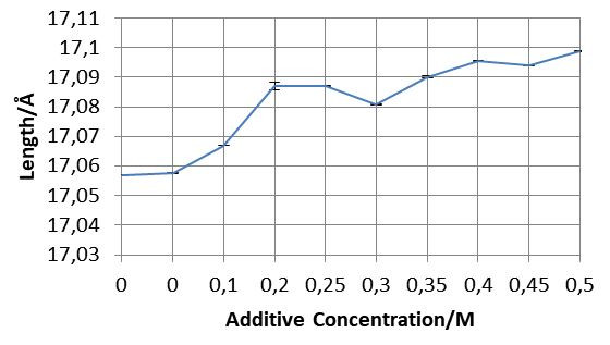
- The increasing length of one of the sides of a polymorph’s unit cells. Look at those tiny error bars!
I’m sure I’ve said this before, but it’s always important to actually look at your data before telling your computer to go ahead and analyse it all. Each time Topas fits a diffraction pattern, it tells you how close it got to the real thing. I noticed that it wasn’t so great at estimating some of the diffraction patterns, and when I looked at them I saw some pretty strange peaks. They were quite small and not in the right place to be a calcite or vaterite peak. They occurred in the same places for each of the poorly-fitted diffraction patterns… Could it be another material?! Claire and Julia (my supervisors and masterminds behind Project M) gave me some information on what these mystery materials could be. I inputted this information into Topas and yes indeed it was a contaminant material! Quite a few samples have shown to be contaminated so far, with the most common contaminants being calcium chloride (tetrahydrate and hydrate) and sodium carbonate. Do you recognise these names? Yes, they’re the products used to synthesise the calcium carbonate for Project M. This contamination doesn’t affect the accuracy of the data, but it does pose many interesting questions. Why do some schools have more contamination than others? (And no it probably isn’t because their washing-up isn’t up to scratch)! Is it because the water they used affected the reaction? Did the additive prohibit some of the products from reacting? I hope I’ll be able to come up with some ideas as to why before I leave in four weeks.
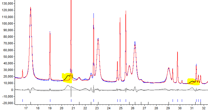
Shining the spotlight on some mysterious peaks…
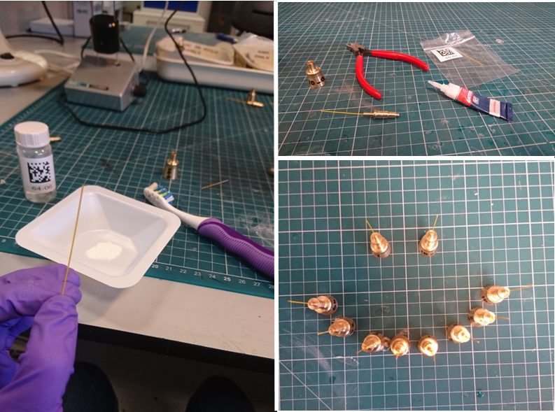
- After some loading (helped greatly by the toothbrush), cutting and gluing, some of the fully-loaded samples seemed pretty happy about heading to I11 for diffraction analysis.
In my previous post I talked about an interesting link between the amount of vaterite present in the samples and the hardness of the tap water used to make the sample. I’m getting some more information on various characteristics of UK tap water (e.g. its pH in different places) first before drawing any more conclusions.
All these trends are interesting, but not completely unexpected. Claire and Julia told me to look at things like unit cell size and strains because they thought that these may change due to the presence of an additive. However, sometimes a large dataset with lots of variables may reveal completely unexpected things. For example, maybe the Project M data will show a link between the hardness of the water and the length of one side of a vaterite unit cell at a certain concentration of some types of additive. This is very hard for us to pick out by looking at lots of plots. Luckily, there’s a type of data analysis called Principle Component Analysis (PCA). It’s quite a sophisticated technique, but it basically looks at all the data and all of the things that you’ve told it can vary (such as additive concentration, unit cell size, water hardness etc.) and plots the data against the things that vary most. The data might form a trend and/or clustes, revealing relationships that would have otherwise gone unnoticed. I’m attempting to modify some code in a language called Python to do PCA on the Project M data set. Who knows what this might reveal!
As always, it hasn’t all been data analysis for me over the past few weeks. I had a day of Python training a few weeks ago. Python can do lots of handy things, is relatively easy to pick up and is widely used in science. It’s definitely worth learning! It’s certainly been useful for me so far in terms of data manipulation and hopefully PCA.
I’ve also had some more time in the lab. Some samples were submitted after the Project M experiment here in April, so we needed to prepare them ready for loading into the I11 beamline. After making sure the robot that loads the samples worked properly, we headed to the lab. Some of the samples hadn’t been loaded into capillary tubes, so that was the first task. Not to worry, I thought, I’ve done this before (see previous blog post). The only difference this time was that the capillaries were Kapton capillaries as used for the rest of Project M, not glass. I thought I understood the difficulties that Project M participants went through filling their capillaries before, but now I truly do. Those Kaptons take ages to fill! Once I’d got the hang of it though I was away, and Claire and I managed to fill them all and load them into their holders before the end of the day. They were analysed a few days later.
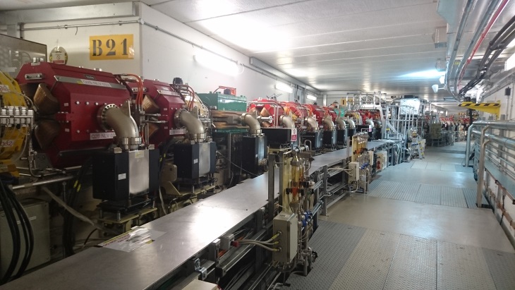
- Inside the ring.
I was also lucky enough to see the inside of the Diamond ring itself one day when the machine was off. Julia took me into the pretty scary-sounding Zone 13 (where the electrons are accelerated and injected into the ring), and then into the ring itself! There were a lot of very impressive magnets and devices in there to manipulate the electrons as they zoom around.
Last but not least, I got to spend a day in London in a Wikithon where you learn how to edit Wikipedia. It was in the Royal Society of Chemistry (i.e. it was fancy) and the theme was Women in Climate Science. Women are really under-represented on Wikipedia, and the number and quality of articles on women STEM areas does not reflect the staggering amount of ground-breaking work women have done. So how do we change it to make it more realistic? We learn how to use Wikipedia and write/edit articles! I had a go at creating a page on climate scientist Marika Holland. Check it out if you want – she’s done/is doing some cool things (you’ll get the pun if you read it)! It’s currently being reviewed before it goes live but should be up in a within a few weeks. I had a really great day and I’d certainly encourage others to go along to a Wikithon or at least learn how to edit Wikipedia themselves – it’s a pretty important and influential website.
Oh, and amongst all that I went on holiday to Belgium. Phew, it’s been busy.
Suddenly there are only four weeks left of my time at Diamond. I have a presentation to give this week on my placement so far, and a poster to make. Time will whiz by I’m sure, but hopefully I’ll get lots more analysis done and find out many more interesting things before I leave. The data holds a lot more science ready to be unveiled!
Until next time,
Alice

Diamond Light Source is the UK's national synchrotron science facility, located at the Harwell Science and Innovation Campus in Oxfordshire.
Diamond Light Source Ltd
Diamond House
Harwell Science & Innovation Campus
Didcot
Oxfordshire
OX11 0DE
Copyright © Diamond Light Source. Diamond Light Source® and the Diamond logo are registered trademarks of Diamond Light Source Ltd
Registered in England and Wales at Diamond House, Harwell Science and Innovation Campus, Didcot, Oxfordshire, OX11 0DE, United Kingdom. Company number: 4375679. VAT number: 287 461 957. Economic Operators Registration and Identification (EORI) number: GB287461957003.